COVID-19 Impact on Educational Achievements - Data Visualization 2024
Visualizing COVID-19 Impact on Educational Achievements
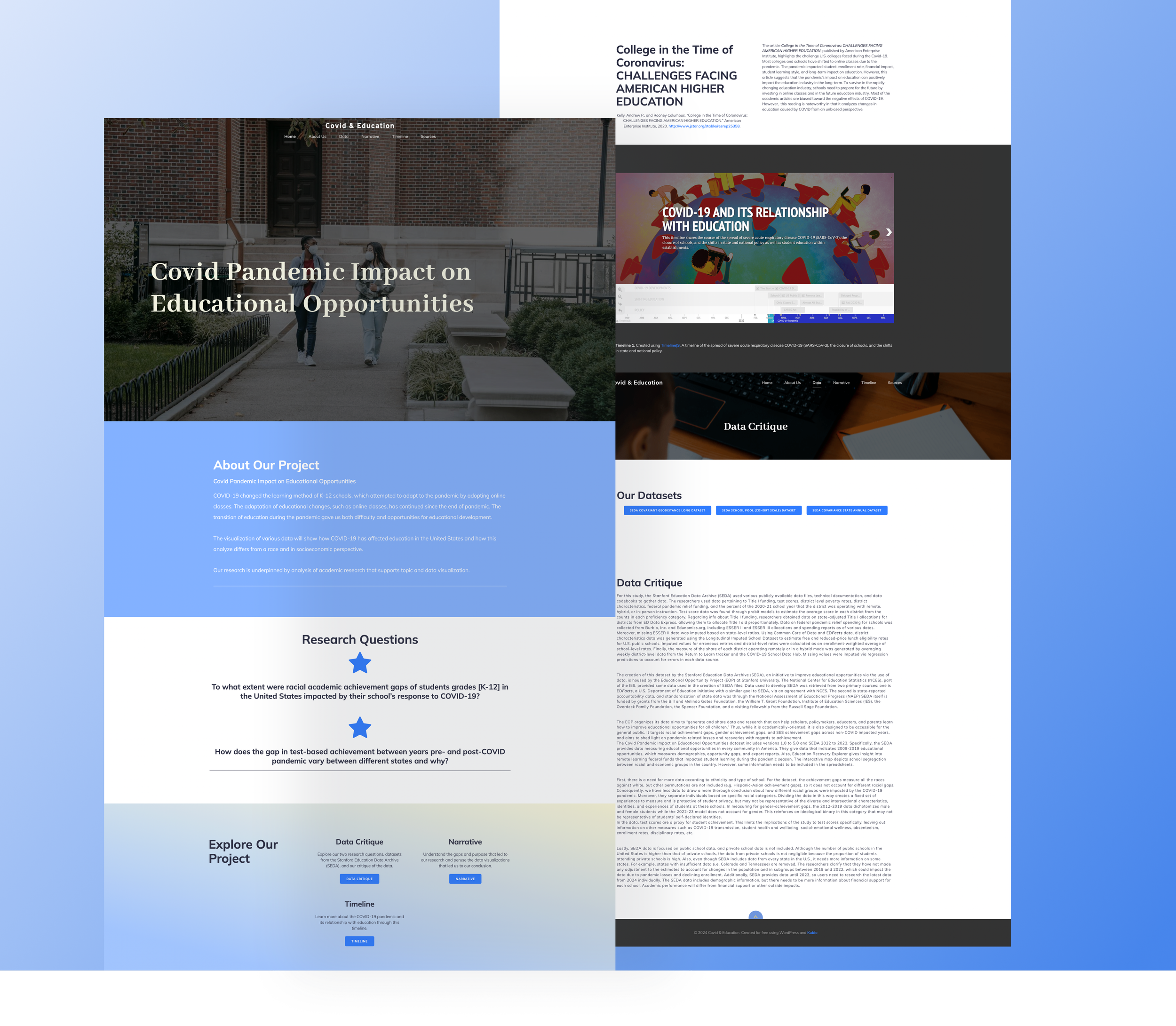
We were tasked with analyzing datasets to show the relationship between academic performance and racial and regional differences during the COVID-19 pandemic. Our data sets came from the Stanford Education Data Archive (SEDA). As a final deliverable, our team created a website that allows visitors to explore the impact of COVID-19 on education.
Tools
Timeline
Role
Collaborators
WordPress
Timeline JS
Tableau
Google Sheets
6 Weeks
(Summer 2024)
Data Specialist
Content Developer
Web Designer
Madeline Kim
Jeniffer Liu
Aline Silva Rodrigues
Sajana Chadive
RESEARCH QUESTIONS
To what extent were racial academic achievement gaps in students' grades [K-12] in the United States impacted by their school’s response to COVID-19?
How and why do the state students live in affect gaps in test-based achievement between years pre- and post-COVID pandemic?
RESEARCH
Before creating the research questions, we did a data critique to find out how data was generated, What the original sources were, what organization funded the dataset, and what information was left out of the spreadsheet. After criticizing the data, to understand our dataset deeply, each of us contributed to an annotated bibliography and collected three journal articles per each of us.
We set 15 research questions based on 5W’s and H's (who/when/why/what/where/how). Among 15 research questions, we selected two research questions that hit points, that are not vague and do not focus on meta-questions (that does not preclude an analysis of the world).
DATA VISUALIZATION
Timeline JS
Timeline JS is an open-source tool for designing interactive timelines developed by Knight Lab at Northwestern University.
Timeline 1. Created using TimelineJS. A timeline of the spread of severe acute respiratory disease COVID-19 (SARS-CoV-2), the closure of schools, and the shifts in state and national policy.
The timeline shares the course of the spread of severe acute respiratory disease COVID-19 (SARS-CoV-2), the closure of schools, and the shifts in state and national policy as well as student education within establishments.
From the start of COVID-19 to the end of the pandemic, this data shows the role of the US government (online learning, vaccine, COVID-19 aid package) in response to the COVID-19 Pandemic. Almost all schools in the US closed during the pandemic and started remote learning.
Tableau - Bubble Chart
How do the socioeconomic status of the state (SES), degree of urbanization, and racial diversity impact educational growth?
Graph 1. Created on Tableau. Shown is a bubble chart with bubbles representing states, size according to socioeconomic composite scores, and compared on % urbanity and racial diversity.
The difference in student performance in regions can be explained by factors that how urban the states are, and allow us to narrow in on other factors that may have affected student performance.
States that have smaller SES composites but larger relative diversity indexes, tend to have greater test error gaps post-COVID.
Our conclusions were: (1) socioeconomic status greatly impacts educational growth and (2) state legislation is important for student education after the start of the pandemic.
Tableau - Dot Chart
What is the correlation between the average socioeconomic status and test scores by state?
Graph 2. Created on Tableau. Scatterplot comparing socioeconomic composite scores to average test scores for each state.
Each dot in the plot represents a different state. It compares the average socioeconomic status of each state and examines its correlation with the average subject-grade-year scores of the state. There is a fairly positive correlation, indicating that students living in states with better average socioeconomic statuses (i.e. less financial hardship, etc) generally perform better than states where students face more socioeconomic hardship.
Overall, students living in states with better socioeconomic status performed better on their scores.
In the bubble plot from earlier, we can see these states are relatively different from each other in regard to racial diversity and urban/rural diversity. (New England vs Mountain Division)
States with lower average socioeconomic statuses collect less taxes and therefore have less funding for their education programs. With COVID-19 having a harsh effect on the country and different states’ economies, the pandemic also impacted students across the country disproportionately, decreasing the quality of education for students in the state that has low socioeconomic status.
Google Sheets - Bar Chart
How do average poverty rates of racial groups impact student performance?
Graph 3. Created on Google Sheets. Shown is a bar chart showing average poverty rates by race in pre-COVID times.
The bar chart examines the average poverty rate (by percentage) among different racial groups in the United States before the COVID-19 pandemic in 2020.
WEBSITE DESIGN
Wireframing
After documenting the contents that we decided to include in our website, I contributed to creating the website wireframe.
Our website includes Home, About, Data, Narrative, Timeline, Sources pages.
Setting up the Website
Website URL: https://humanities-a5.humspace.ucla.edu/
REFLECTION
The Visualizing COVID-19 Impact on Educational Achievements project taught me how to effectively utilize various data visualization tools, such as Timeline JS, Tableau, and Google Sheets, to represent the analyzed data.
As a data specialist and web designer, I had the opportunity to learn the importance of communication with other team members. Since each person was responsible for delivering their work results, effective communication was essential for successful teamwork.
If I were to continue this project, I would develop it further into another project that aims to increase the educational opportunities of socioeconomically minor communities. For example, I could build an educational game app designed to provide children with easy access to learning resources.


